
Icons of the dead: visualising the deaths of migrant workers in Qatar.
Update: The data from the WaPo story was challenged by the Qatar Government resulting in an amendment stating that the data was deaths for all migrants not just those working on world cup venues. Something, in a uncharacteristic bit of comment baiting, Roy Greenslade felt the need to point out.*
The Washington Post is getting a lot of (social media) interest with a visualisation of the The human toll of FIFA’s corruption. It links the recent FIFA arrests and alleged bribery in the bid for Qatar to get the word cup to the miserable plight of foreign workers building the stadiums for the 2022 event. It’s a compelling graphic and one that makes effective use of scrolling.

It’s not a new idea – it calls to mind a visualisation from last year by, recently closed, data journalism site Ampp3d:

Breaking down the numbers of dead against the teams and then giving you the remainder is a powerful visual storytelling device, as many commented at the time, especially in mobile where the smaller screen meant more scrolling, emphasising the scale of the deaths. It was something Buzzfeed proved later that year with a visualisation of how many soldiers died in World War I.
The staggering number of deaths of migrant workers means that any visualisation is going to have and impact. The difference in scale in this chart from London Loves Business in 2014 (charting similar data to the WaPo piece), gives you the same scrolling impact:

The sheer height of any comparative data has an interesting interplay with architecture, something that spontaneous architects Axel and Sylvain Stampa Macaux thought about. At first glance their visualisation exploits that construction metaphor.

But it’s actually a plan for an imagined piece of real architecture:

Compelling stuff.
All of this gives me pause for thought.
On the one hand it makes me think of innovation in journalism. Many have noted how innovative Ampp3d was in data journalism. A mainstream news org putting that form of storytelling out there, doing journalism with graphics and, more importantly, emotion, has given others permission to try. I’m not saying the Wapo copied ampp3d. The journalism industry is one that thrives on monitoring and imitation for innovation – look at the use of listicles and quizzes. It’s interesting to see how this helps make new forms of storytelling acceptable and how it filters through.
**UPDATE: **As this video from Channel Four suggests
On the other, and more fundamentally, it reminds me about the challenges of making data from the human experience.The Wapo piece opens with the line “In the end, it only took a $150 million scandal to make Americans care about soccer.” That’s* care about football*, not to care about the death of 1000’s of migrant workers; something that’s been reported on for a few years now.
![]()
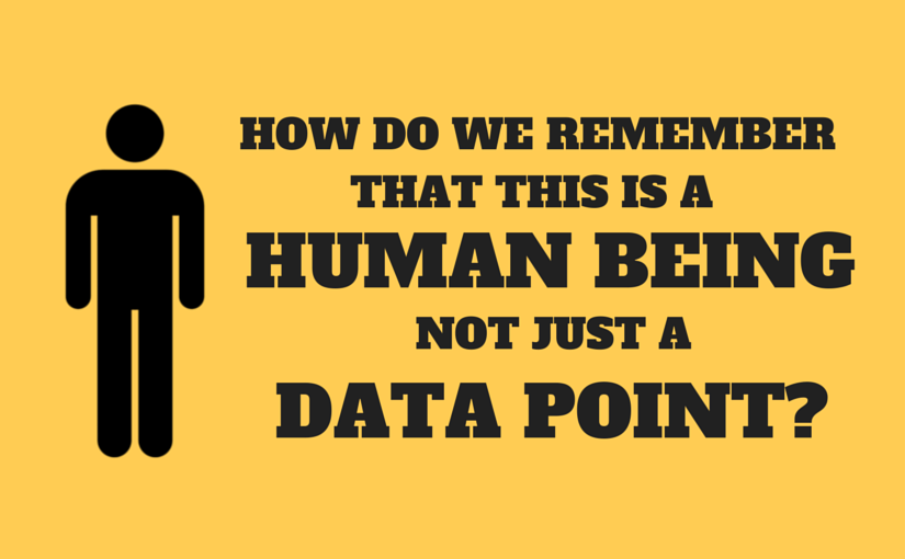
I’m not having a pop at the Washington Post there. It’s really a fundamental challenge in journalism – how do you get people to care about what’s happening to people far, far away who, to all intents and purposes, are nothing like them? In the economics of news agendas, proximity is factor. You need more deaths the further away from market you are if you want to work your way up a running order. Paul Bradshaw wrote about that a while back, pondering the scale at which we can lose the human in the statistic. The Ampp3d piece plays on this nicely – 23 players for 23 lives; 23 people you can relate to for 23 you can’t. It adds context for the audience.
The challenge to convert the ‘impact of the scroll’ into concern for the people that whizz by. As I say, it’s not a new challenge, but one that is perhaps more of a challenge when you’re competing for eyes and the kind of content consumption that creates opportunities in the scroll in the first place.
The socially shareable nature of graphics like the Wapo one can’t be underestimated in their impact. Already people are using it to lobby sponsors on Twitter. So it’ll be interesting to see what impact the Wapo version of the chart (and the story) has this time around with the added FIFA element for context.